A UX Case Study
Designing for project clarity
“We want an application to manage projects but also we want to add 10 different data sets into a single screen. You get me?😶🌫️”

Intro.
The most difficult part about building a dashboard-y platform is ensuring that you integrate multiple data sheets, filters, functionalities, dashboards all into a single page while also ensure that it looks pretty.
Project Details
a little bit of a background story.
For managing their customer projects, our client juggles multiple in-house tools to manage cross-functional project delivery, leading to communication silos and inefficient workflows.
Across CNS S&C Domains of work, critical project data lives in digital silos—scattered between offline spreadsheets and SharePoint sites—with no single source of truth for customer projects.
Three major challenges faced thus far are:

Fragmented data
Scattered data = slow progress. Critical project info is trapped in offline files and SharePoint, hindering seamless collaboration.

KPI Blind Spot
Without a central view of project milestones, we're flying blind on service delivery performance, risking quality and customer satisfaction.

Communication Chaos
Scattered project info breeds breakdowns and stalls teamwork.
The process panned out across over a duration of four weeks as given below.

so here's how the process started.
the process.
Figured it out first. (took us longer than we expected)

tldr; The platform we had to design essentially is a project management platform that will allow the technical delivery managers (TDLs: managers that track technical deliveries across various projects) to monitor the submissions of their subordinate employees. All the projects have various milestones or stages through which they go through, each of these stages have specific work packages (sub-domains) and all these work packages have work items.
Currently, they are using a platform called Planner that helps them track the list of projects and assignments and different databases across which their tasks and data are spread.
They want a unified project management platform that can draw data from these different databases and give them a singular view of different projects and the work packages within them so that task and progress tracking are easier and convenient.

so our next step was to lay down a giga-map of everything.
the process.
three things that helped us bring things into perspective:
User Personas.
We had multiple users that we were building this platform for therefore we had to list all our personas down first.

(please note that this is a snapshot from our original file)
We also conducted stakeholder workshops to identify the exact roles and tasks performed by each of these roles and their dependencies on the platform in the purview of management.

User Journeys
With the information we received about our target user personas, we generated a user journey to map out the main steps in the platform for our stakeholders. This was a highly collaborative process.
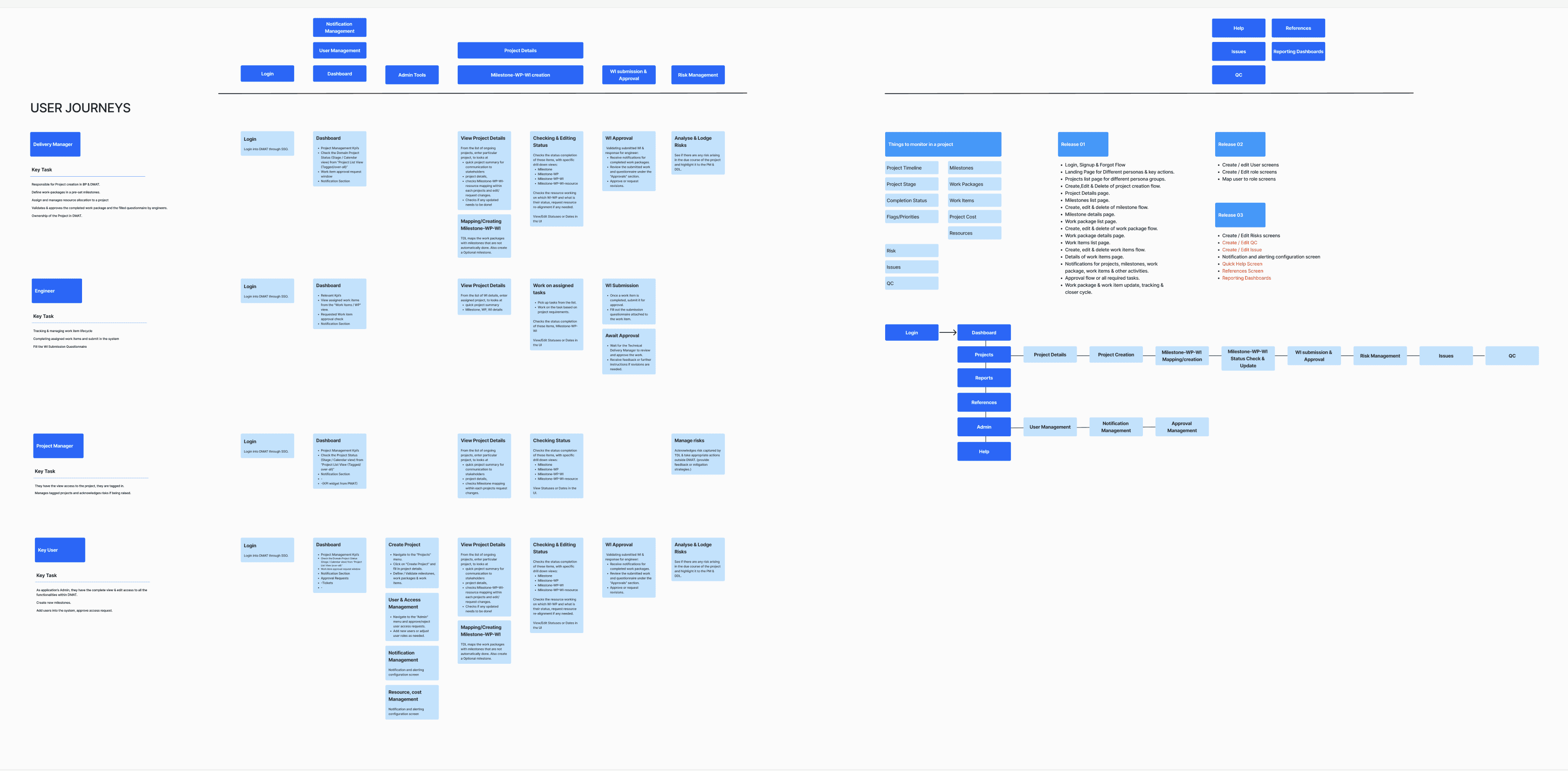
(please note that this is a snapshot from our original file)

the deliverance
final designs.
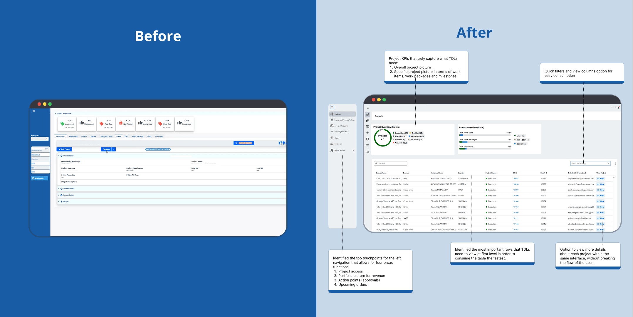
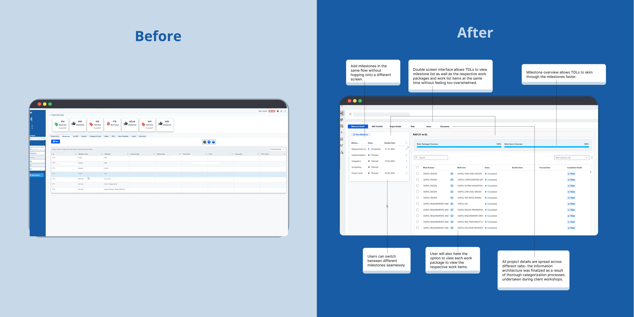
As a result of our user flows and journey, we worked hard on building the lo-fis first. For the final designs, we leveraged their current design system and prepared a design kit which contained the main components needed for most of our screens (Status markers, KPI boxes, Right sliders, Tables, Headings, Left navigation, Top navigation, Notification boxes etc.)
We wrangled stakeholders and charmed clients, turning their feedback (and maybe a few strong opinions) into technically sound and business-savvy designs.
Finally, we delivered the revised design screens providing a detailed guide for development and ensuring the final product aligned with the design vision.
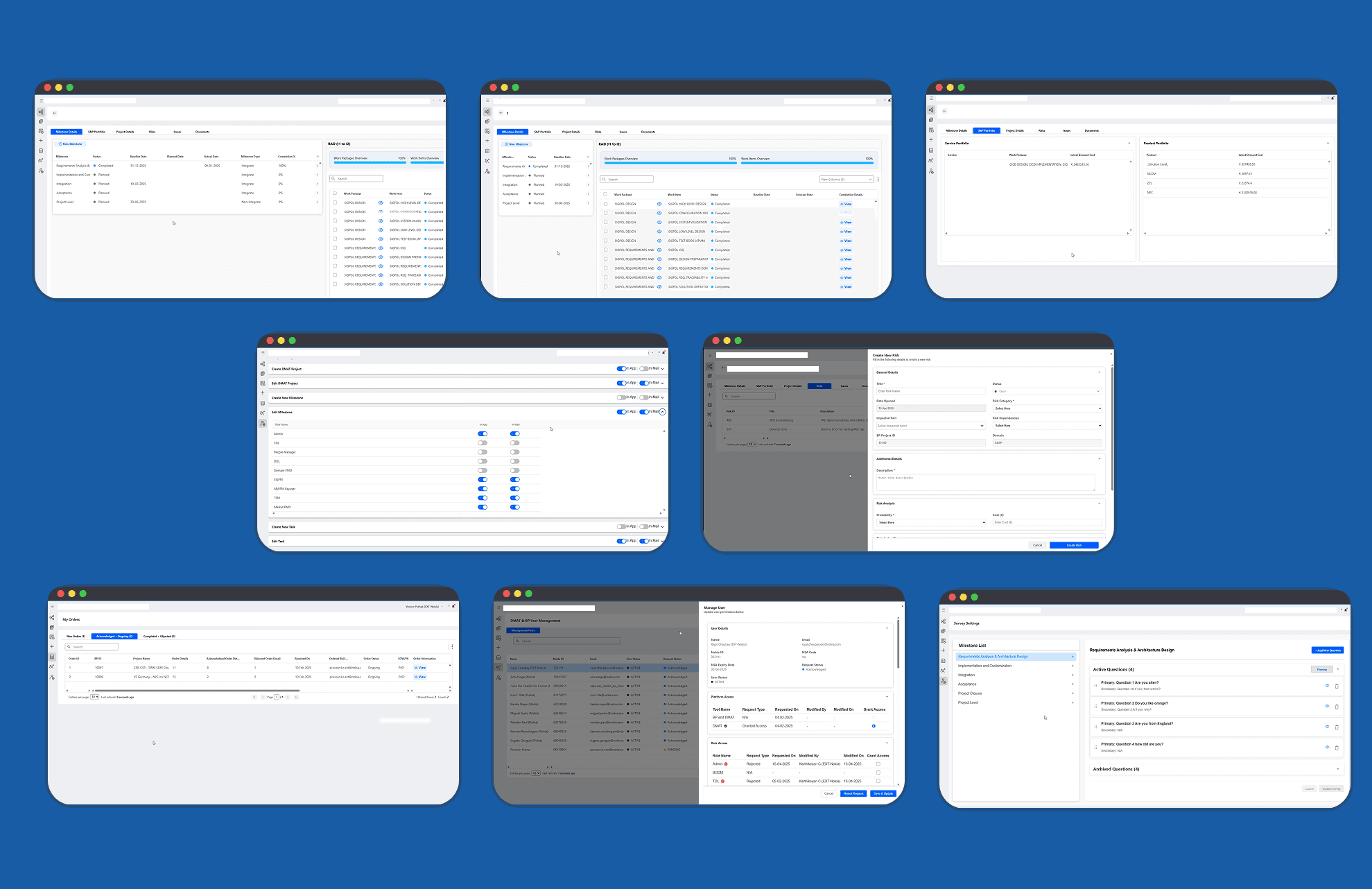
This approach resulted in the design of Dashboard, Project list view screen, Project details screen, Milestone screen, Work Items screen, User management, Survey settings, admin settings and so on.
the deliverance
just a glimpse.
reception.
As the project in still in production, following is the potential impact we are aiming to get:
By eliminating the need to search across offline spreadsheets and SharePoint, technical delivery managers could potentially save 8 hours per week. This translates to a significant reduction in time spent on non-value-added tasks.
Centralized data access can accelerate decision-making processes by an estimated 10%, leading to quicker issue resolution and proactive risk management.
With a central view of project milestones, the platform can enable a potential 20% improvement in on-time project delivery by allowing for better tracking and early intervention.
The combined impact of reduced search time, faster decision-making, and improved collaboration can lead to an estimated 40% increase in overall team productivity.
my learnings.
Embarking my first project in a full-stack UX unicorn role, I had the distinct honour of architecting an end-to-end project management platform for the one of the biggest titans in the global telco and IT landscape.
I honed my skills especially in stakeholder management. It wasn't just about taking orders; our design team wielded a surprisingly influential voice in shaping critical UX decisions. We collaboratively sculpted everything from the grand strategy down to the nitty-gritty micro-interactions.
My toolkit got a serious workout, running the full design gauntlet: from decoding stakeholder asks and mapping user journeys to wrestling with wireframes. I was also actively involved in recreating components from their existing design system to modify and fit our templates.
This project was a sandbox for design experimentation. I relished the challenge of designing user-centric layouts that met the exact user needs we were targetting. Every pixel or component placement became a strategic micro-decision.
With this, we come to an end to my UX research case study, thank you for reading through it and being patient. If you have feedback for me, please do not hesitate to reach out to aditiroychoudhury@gmail.com.